The Math of Nested Comments
Why a comment thread is a layout problem before it is a product problem — rails, elbows, depth, and the one flex gap that breaks the whole tree.
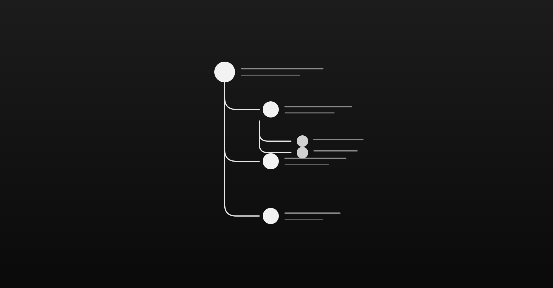
A nested comment looks simple until you draw the lines. Then it becomes a geometry problem: every reply needs a rail that meets its parent’s avatar center, an elbow that turns into the child, and a continuing stem that survives siblings, flex gaps, and unlimited depth. Get any one of those wrong and the thread looks broken — not “a little off,” but broken, the way a cracked spine looks broken.
This is how we built Inset’s comment component, what we learned from Ahmad Shadeed’s reconstruction of the pattern, and the one measurement that kept opening a gap after the first layer of nesting.
The markup is the easy part
A comment tree is an unordered list. A reply is another list inside a list item. Semantically that is correct, and it is also the whole layout contract:
<ul data-depth="0">
  <li>
    <article class="comment">…</article>
    <ul data-depth="1">
      <li>
        <article class="comment">…</article>
      </li>
    </ul>
  </li>
</ul>
The <li> is the home for the comment. Indentation belongs to the nested <ul>, not to the comment row. Shadeed’s insight — keep spacing on the list, keep the component itself simple — is the difference between a thread that scales and a pile of margin-left hacks that collapse the moment you add a third depth.
Three strokes, one rail
Visually, a nested reply is three strokes that must share a single center line:
- Parent stem — a vertical under the parent avatar when that comment has replies (
li:has(> ul) > .comment::before). - Sibling rail — a vertical on every nested item that is not last (
li:not(:last-child)::before). - L-curve — the elbow into the reply avatar (
li::afterwithborder-inline-start,border-bottom, andborder-end-start-radius).
If those three disagree about where “center” is, you get the classic broken joint: a vertical that stops, a dark gap, then a curve that starts a few pixels to the side.
The fix is a shared custom property. Every nested list carries --rail-size equal to the parent avatar size at that depth. Stem, rail, and elbow all resolve to the same inset:
inset-inline-start: calc(
  var(--rail-size) / 2 - var(--comment-line-width) / 2
  - var(--comment-indent)
);
Logical properties (inset-inline-start, border-end-start-radius) keep the same math in RTL. The rail is not a left-edge decoration; it is a center-line contract.
Depth is unlimited; size is not
Nesting should not cap at two or three levels. The data structure is recursive — a comment has replies[], each reply is a comment — so the UI should be recursive too. Reply is always available. Depth is just a number you pass down.
Avatar size is a separate cue. Root comments stay large; nested comments shrink. That is hierarchy for the eye, not a limit on the tree. Shadeed’s article stops at depth two for the demo; the geometry does not require you to stop.
The gap that flex introduced
After the first layer looked right, deeper threads still cracked. The culprit was not the curve radius. It was gap.
Nested lists used flex column with a gap between siblings. The sibling rail stopped at bottom: 0 of each <li>. The next elbow started at the top of the next <li>. Between them sat an empty flex gap — and that empty strip is exactly the “broken” joint you see in a screenshot.
The parent stem already knew the fix: extend through the gap with a negative bottom equal to the gap size. Sibling rails needed the same treatment:
li:not(:last-child)::before {
  top: 0;
  bottom: calc(var(--comment-li-gap) * -1);
}
Seal the elbow with a slight negative top on the curve (Shadeed uses about two pixels) so stem and L-curve overlap instead of kissing with a hairline of background between them.
outer = inner + padding is the concentric radius rule. For threads, the sibling rule is quieter: rail length must include the gap, or the gap becomes the break.
Comments are Typeset, not a second prose system
A comment that renders Markdown as plain muted text is a different product from the article above it. Inset runs both through shadcn/typeset: articles use typeset typeset-article, comments use typeset typeset-comment. Same CSS file, two presets — size, leading, and flow — so discussion inherits the reading system instead of inventing a chat skin.
The composer is Write / Preview with real formatting inserts (bold, italic, code, link, list, quote), not a decorative toolbar. Enter posts; Shift+Enter makes a new line. That is the keyboard contract people already expect from tools they write in all day.
What the component is really for
The comment UI is not the product. The product is a blog system for engineers: long-form Typeset articles, nested conversation under them, and a publishing path that will eventually pull from Notion or Google Docs. The thread anatomy is the part that has to look inevitable — because if the rails look improvised, the whole surface feels improvised.
Draw the three strokes. Share the rail. Extend through the gap. Nest without a ceiling. The rest is content.
Related posts



Comments(5)
The concentric radius tip alone was worth the read. I’ve been matching outer and inner radii for years without realizing why it felt off.
outer = inner + padding— that’s the whole rule.Same — once you see it, you can’t unsee the mismatch on nested cards.
Exactly. Glad this landed.
Also useful with Typeset measure caps — nesting and measure fight each other if you’re not careful.
Clear writing on a topic that usually gets hand-waved. Would love a follow-up on how this plays with nested dialogs.